For my Vector-based redesign, I did two different options – one traditional and the other more modern.
First the Traditional one:

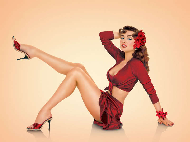
The Home page, showcasing a prominent photograph (I found this photo on the web as the original site is written in Flash, preventing me from using their assets in my redesign. Of course, a photograph from the studio would be in place here.)
The Logo, Header and Navigation are all in one across the top.
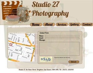
Contact page, using the same interface, but substituting a map and contact form for the photograph.
In both cases, a very pale version of the logo image is just visible in the background, to give a little texture to the pages.
… and for the Modern interface:

The Home page is simple and sleek, with lots of white space around the assets.
I chose to place the navigation vertically on the right, which may present problems in Dreamweaver, but I wanted elipses to reflect the camera lens in the logo and I’m an artist, so there you go…
 For the Contact page, I again used a map and contact form, keeping with the sleek, white look.
Image Resources:
Traditional:
Old Camera: http://www.geozero.com/assets/images/old_camera.gif
Modern:
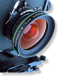
Modern Camera: http://upload.wikimedia.org/wikipedia/commons/a/ac/Large_format_camera_lens.jpg
Head shot: http://www.headshot-photography.com/photos/caseyg_1.jpg
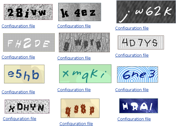
Captcha: http://www.bugtreat.com/blog/wp-content/uploads/2012/06/Captcha-Image-Verification-Code-php-script.gif
