For my Simple design, I decided not to use any pictures. This was all created using text and photoshop shapes.
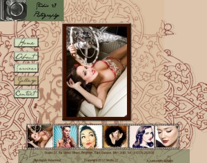
I wanted to create a clean corporate design. This is the Home Page.

I started with Logo creation and came up with this:
![]()
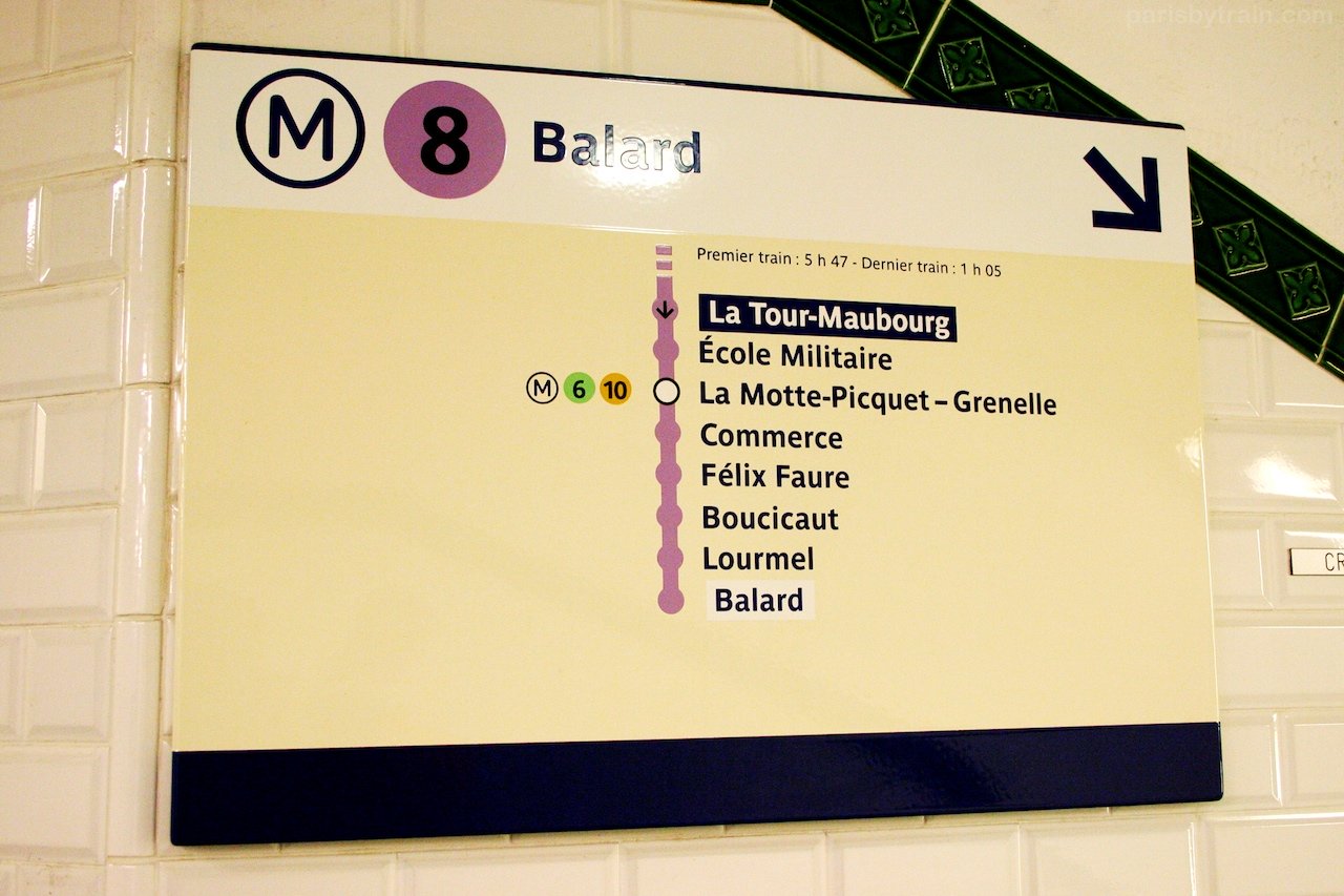
I thought it reminded me of maps in the Paris metro so I took a look at some.
I found a photograph of the Balard Station in Paris and this gave me the inspiration to create the interface.
I thought about animation to zoom out and in on the area of the map navigated to. Here is the Services page.

I would probably have found this easier to create in illustrator, especially the track map, but I found the guide lines in Photoshop useful to line everything up.
I do like the clean lines and I don’t think it looks too corporate for the subject of the website, but I prefer the designs with images for this particular website as it is a photography studio.
Different themes work well for different websites; this design would look good in another context. Eg a business offering corporate service. Something to do with transport or logistics, perhaps a shop selling sleek, stylish products.
This is a simple corporate logo I made for practice:
 This was easy to make and looks very business-like and simple.
Image References:
Balard station map: http://parisbytrain.com/files/2008/07/sign_metro_line_8_balard.jpg


