Tag Archives: Photoshop

Evaluation of Project – Illumina

Standard

For this project we worked in groups.

I was working with Katie Waldock, Clare Haldon and Mark Smith.

As with any team, we each had individual strengths and we tried to utilise this diversity.

My skills lie mainly in design, project conception and testing and so my input fell mainly in the inception stages. as we designed the layout and content of the page, and at the end, when the site required rigorous testing in multiple browsers. I worked in the meantime creating some of the animated Gifs.

Mark is a great organiser and pulled together the folder required for the brief, locating all the information required and setting it out coherently. He also produced some of the graphics, the logo and the About page.

Clare’s expertise lies in Illustrator and so we turned to her for the page’s main graphical layout. She produced the larger vector graphics which formed the basis of our page.

Katie is the coder of the group, having worked in programming previously. She coded the website using Dreamweaver, pulling together everything created by the group.

Our initial research led us to look at various sites. One which stood out was Ben the Bodyguard.

We were impressed by the way the figure appears to walk down the street as the page is scrolled. In face it remains in the middle of the screen, but the impression was one we wanted to use in our website.

After some discussion, we decided to us a tall building, with a glass elevator on the front. We would place a figure in the elevator and as the page scrolled down, the lift would appear to descend the building.

Clare got to work making the building and lift in Illustrator.

building-illuminaOur project required us to produce some animation, so we decided to decorate the building with neon signs, which Mark and I made in Photoshop, animating them into gifs. I produced the clickable signs (the ones which let to other pages)

about-us

Location

Contact


and Mark made the static signs.

lips_neon_sign_110-A06-A

neon-cup

neon-girl

only-god-forgives-neonposter

we're-open-neon

In the meantime, Katie produced a couple of animations for two of the windows:

frame-party-window

frame-spy-window

and Clare built a taxi and helicopter for a “spy-getaway” animation we wanted to make to start and finish the page experience.

final-taxihelicopter-animation


Mark put a folder together of all the administrative work we needed and made an illuminated sign for the page.

illumina-logo-neon-with-stars_final


Gradually, the pieces were coming together and it was mainly down to Katie to write the code and bring it all together.

Owing to illness and work commitments, my input througouht the project was minimal, so I tried to redeem myself a little by testing the site in several browser and offering constructive feedback.

With browsers differing so much in the way they display pages, we found it very difficult to present a website that worked in every one.

The best we found was Safari, which seemed to have fewer glitches than the others. firefox and chrome both had display problems, rendering the whole image too large and off to the right of the page.

The secondary pages, which Mark put together, mostly displayed well, so it was the large images and animations which were causing problems in the web browsers.

The final piece can be seen here.


Water Project – Banner Ads

Standard

Banner Ads

As part of my project “Water: The Source of Life” I have created two banner ads for the website.

For the first, I was supplied with the text and the dimensions.

I made a gradient background, added the text and logo and added drop shadow around the text to give depth and texture. I think it gives the impression of clouds, although this was not my intention.

The second banner came straight from my imagination:

I was given the dimensions and used a photograph of a water droplet as the background. I created the text and centred it all on the page. The text, read downwards, is intended to mirror the drop of water.

In both banner ads, I made a “call to action” button. Although the whole ad would probably be ‘live’ (ie: you click anywhere on it and it takes you to the link,) it is psychologically inticing to press something that looks like a 3D button. We instinctively are drawn to such objects, so it is a good idea to add one, to let the viewer know that this (the ad)  is something clickable.

To make it, I simply drew a ’rounded rectangle’ with the draw tool, gave it a slight drop shadow and bevel, then added text on top, which I also gave a slight shadow, to make it all stand out a bit.

I am particularly pleased with my Saving Water ad, but I prefer the button on the Blue Planet ad.


Photo Reference:

Water Droplet


Water Project – The Header Graphics

Standard

Header Graphics for Water: The Source of Life.

I have finally finished the header graphics for my project “Water: The Source of Life.”

Having worked on the images for the headers, I then added text.

I only need two, but I have come up with 5 alternatives:

New York under water, with text added along with National Geographic logo.

This is not one of my favourite images of the five. I don’t think the underwater effect is prominent enough. If I was more skilled in Photoshop, I would have liked to create some decay and texture to the buildings, but this is something I will hopefully learn in the future.

Paris under water with added text and National Geographic logo

This is the first image I created and conversely the one which I have tinkered with more than the others. Again, with better skill I would have liked to create more rusting and decay on the Eiffel Tower. I do like the underwater effect here and the way the city appears to have ‘fallen’ into the rocks.

Rome under water with added text and National Geographic logo.

Although I like the light and water effects here, I’m not sure I’m really happy with the way the buildings have come out. I fiddled (that’s the technical term!) with the  foliage in the foreground to try to create more depth and texture, but I don’t think I was very successful.

I do like the way the title text came out on this one though.

San Francisco under water with added text and National Geographic logo.

I was surprised at how well this one came out. I was lucky with a good image of San Francisco to start with and the water fitted very well with the overall look.

Sydney under water with added text and National Geographic logo.

Although I made this image as an afterthought, having created the others and deciding that I ought to represent Australia too, I actually like this one best of them all.

I like the way the water has affected the buildings and I think it is the most underwater-looking one of the set. I also like the text on this, as it stands out just right.

Image References

Underwater Image 1

Underwater Image 2

New York

Paris

Rome

San Francisco

Sydney

Photoshop CS6 – Adding Texture or Image to Text

Standard

Texturizing Text

It’s easy in CS6 to add a texture or image to text. It used to be a rather complicated process is former versions but those nice people at Adobe have simplified the process for those of us who like our interesting text.

Here’s what to do in easy steps.

1) Open a Photoshop document and use the text tool to write your text. Choose a chunky font so that the image/texture will show up well.

2) Choose your texture and place this on top of your text.

3) Go to the Layers panel and hover the mouse between the image and text layers. Hold down the Alt/Opt key.

4) An angled arrow will appear (not like the one in the picture – I’m just showing where it will be.) This is when you click… and presto! The image and text meld together!

You can move the image around to get it just right.

The layers pallette looks like this:

And there you have it – no complicated masking etc. Remember to hold the Alt/opt key down though, or it will not work!

Photoshop Tutorial – Selection Techniques

Standard

Selection Techniques

Today I have been learning about the different selection techniques available in Photoshop.

1. Magic Wand Tool

 In CS6, the Magic Wand Tool looks like this:

To Select an area (works best on an image with little or no background:)
* Click on part of the background. This should select all the background, but you may need to alter the tolerance to ensure all is selected. You can delete the background at this stage if you wish, or…

* Click > Inverse to select the image, instead of the background.

* Copy this image and paste into  another file (eg: on another background.)

Here are some I did earlier:

This image was created by selecting the Duck from this file:

The Frying Pan was selected using another selection tool:

2. Magnetic Lasso


In CS6 the Magnetic Lasso looks like this:

* Choose the Lasso icon and click Magnetic Lasso Tool.

* This tool also works best where there is little or no background, or where the contrast between the image you want to select and the background is quite sharp.

* Use the tool to draw round the image, carefully. There is a tiny arrow which indicates where the selection will take place and the image is selected by a series of “marching ants.” These disappear when the selection is complete (the line must join up with itself.)

* This image can be copied and pasted onto another image or background, as I have done with my practice above.

 Finally, the clock was selected using:

3. Pen Tool

 In CS6 the Pen Tool looks like this:

* Select the Pen Icon and choose Pen Tool.

* To use the Pen Tool, you need to get used to Bezier Curves.

* Click on a point just inside the perimeter of your selection. Then click another point a little further along and drag a line outwards.

* Use the point of this line to adjust the curve of your selection line.

It looks a little like this:

* It takes some practice, but it is a very accurate way to select an image, especially if there is a complicated background to extract from.

4. Refine Edges

Sometimes you may want to select an image with a very detailed outline, like this:

This would lake a lot of very difficult cutting out if I were to use any of the methods above, but there is an easier way: Refine Edges.

* First, Select the image with the Lasso tool. Do not worry about getting it exact around the edges:

* Now click on the Refine Edges button and ensure you select On Layers, so you can see what you’re doing.

* You can brush around the edges of your image and the Refine tool will select the fine detail for you.

* As with other methods, the sharper the contract with the background, the better the image selection.

* In may be necessary to use a variety of selection tools in order to get the image selection just right.

5. Eraser Tool

In CS6, the eraser tool looks like this:

I looked at the eraser tool as a way of selecting part of an image. The tool can be used to remove part of an image, leaving another image underneath or adjacent to it.

An example could be layering two images on top of the other and using the eraser to remove some of the upper image, revealing some of the image beneath, as I have done here:

I used the eraser tool to remove some of the wave layer, revealing the seafront and sky underneath.

I’m not entirely happy with the results so far and would like to figure out how to make the wave more prominent, without a harsh edge. (I have used Multiply to blend the layers, but I don’t think it looks right.)

I need to work on the image some more.

References:

Photoshop Icons

Bezier Curves

Freebies

Standard

I love free stuff, especially if it’s good.

And I’ve been enjoying some free tutorials on Lynda.com – learning about web design and Photoshop. There are a lot of top quality tutorials available and even more if you pay a subscription.

Today I discovered another site offering free tutes – PlanetPhotoshop.com

I have yet to watch any of their videos, but it looks like this will be another source of free quality information!

Some more to try are:

Adobe (get it straight from the horse’s mouth!)

Tutsplus

Tutorialized

and Smashing Magazine.

With all this free stuff to watch and learn, I’m going to be really busy!

Photoshop Workshop – Layer Styles

Standard

I am getting to grips with Photoshop CS6 and today I took a look at Layer Styles.

I’ve never really used the myriad of styles available (apart from Multiply) so it was  good to take a look at the effects possible by overlaying images and applying a layer style.

I took the three images above and applied the following styles:

Vivid Light

Subtract

Soft Light

Screen

Saturation

Pan Light

Overlay

Multiply

Luminosity

Linear Light

Dodge

Burn

Lighter Colour

Lighten

Hue

Hard Mix

Hard Light

Exclusion

Divide

Difference

Darken

Darken Colour

Colour

Colour Dodge

Colour Burn

I haven’t altered anything else with these images, so the full effect of the layer style can be seen. I love the different effects I’ve created here and I can see myself using layer styles a lot more in the future.

Picture References:

Branch

Ice Cubes

Pancake Ice

Images; Sourcing, Digitising and Defects

Standard

Scanning

The computer devices required for scanning an image are:

  • a flatbed scanner or a negative/slide scanner or an all-in-one printer (which has a scanner built-in)
  • scanning software which will include a driver for the specific scanning device
  • a program to view and edit the image
  • a computer

Screen Grabs

There are different ways of screen-grabbing and these are dependent on whether a PC or Mac computer is being used.

For a PC:

Print Screen

Press the print screen key which looks like this: This puts a picture of the whole screen on a clipboard.

Press Alt+Print Screen gives you a picture of the current window and puts that on a clipboard.

You can paste the image from the clipboard into a document.

Snipping Tool:

This enables you to draw a box around the part of the screen that you want to grab. Snipping tool can be found in the start menu. this image can be placed on a clipboard, as above, or saved as a PNG file.

For a Mac:

Shift+Cmd+3

This gives you a complete screen grab and places the file on the desktop. Press ctrl as well to place the picture on a clipboard (so that you can place it.)

Shift+Cmd+4

This enables you to choose the area you want to capture. Pressing ctrl will again place on a clipboard.

Cmd+Shift+4 once. Then press Space once.

The mouse icon turns into a camera icon and you can click on a window to take a screenshot of that window. This copies the active window and puts it on the desktop.

Digital Cameras

The computer devices required for digital  photography are:

  • a digital camera
  • a computer with usb port
  • software to view/edit the image
  • driver for the specific camera (sometimes this is a virtual drive)
  • May need a card reader if the camera uses SD cards

————————–

Problems with Image Capture

Moire Patterns

When printed images are scanned, sometimes the pixels do not line up and a swirling effect occurs. It is possible to get software which will add a gaussian blur to the image to even this out, provided the image is scanned with a very high resolution.

Pixelation

All digital images are made of pixels (picture elements – tiny squares which make up the whole image.)

If the image is low resolution or enlarged a lot, the pixels become very visible and make the image look “pixelated.”

Can also be a problem on very high resolution screens.

Always save an image with the highest resolution possible, to avoid this, but this may make the file size quite large.

Images can be “bracketed” which means saving them in different resolutions for use on different screens or for print.

Resolution

Resolution problems can occur if

  • an image has been enlarged too much (becomes pixelated.)
  • if a file is very large it may take too long to load (on a website.)
  • a type of moire pattern can occur when a picture is zoomed in an animation and the picture is a similar resolution to the screen.

To alleviate the last problem, use a high resolution picture wherever possible and ensure it is at least 3 times the resolution of the screen.

Colour Casts

Colour casts occur when a photograph is taken under artificial light. A yellowish tint is seen on the picture.

Also on a very sunny day, the ultraviolet from the sun can cast a blueish hue to the picture.

These problems can be corrected in Photoshop or with the use of a photographic filter, or some cameras have settings to alleviate colour casts.

————————–

File Formats

JPEG,

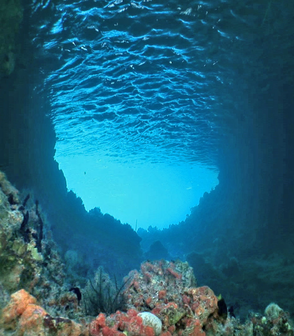
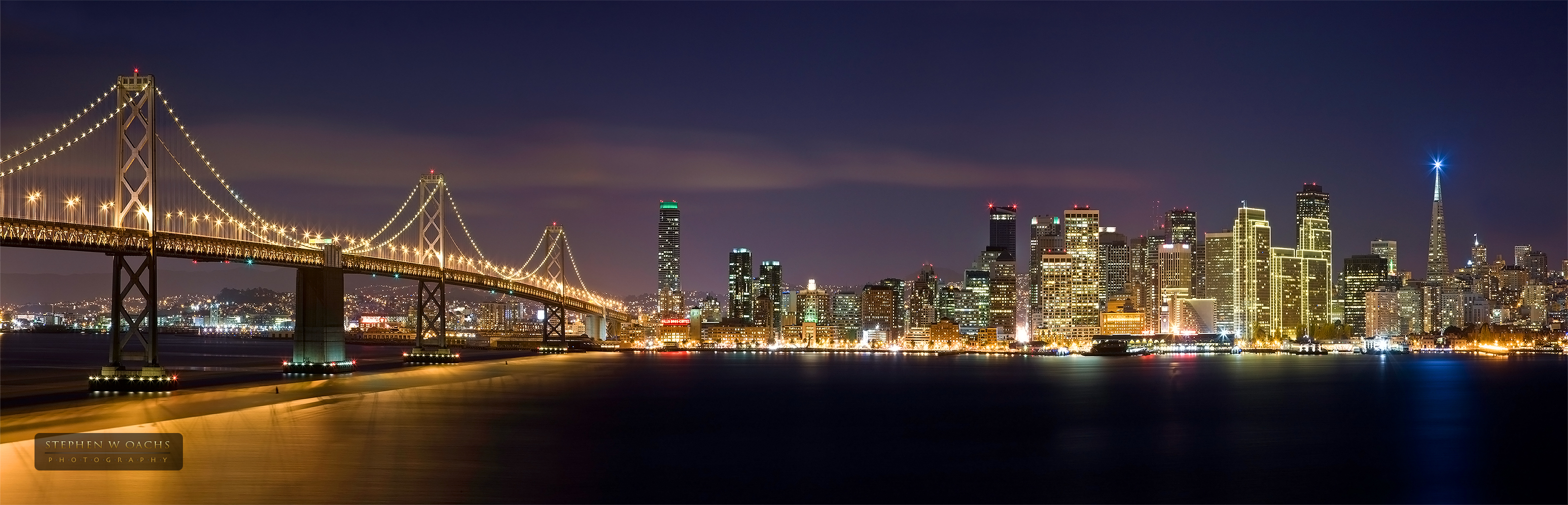
JPEG is a commonly used method of lossy compression for digital photography. The degree of compression can be adjusted, allowing a selectable tradeoff between storage size and image quality. JPEG typically achieves 10:1 compression with little perceptible loss in image quality.

JPEG compression is used in a number of image file formats. JPEG is the most common image format used by digital cameras and other photographic image capture devices; it is the most common format for storing and transmitting photographic images on the World Wide Web.

The term “JPEG” is an acronym for the Joint Photographic Experts Group, which created the standard. (1)

Here is an example of a Jpeg:

GIF

GIF stand for Graphics Interchange Format and  is a bitmap image format. It is widely supported and portable, making it very popular. The format supports up to 8 bits per pixel thus allowing a single image to use a palette of up to 256 distinct colors.

GIF also supports animations and allows a separate palette of 256 colors for each frame. The colour limitation makes the GIF format unsuitable for reproducing color photographs and other images with continuous colour, but it is well-suited for simpler images such as graphics or logos with solid areas of color. (2)

Here’s an example of a GIF:

TIFF

TIFF stands for Tagged Image File FormatIt is a file format for storing images, popular among graphic artists, the publishing industry,and both amateur and professional photographers in general. The TIFF format is widely supported by image-manipulation applications, by publishing and page layout applications, by scanning, faxing, word processing, optical character recognition and other applications. Adobe Systems now holds the copyright to the TIFF specification. (3)

Here is an example of a TIFF:

Notice how you can’t see it? That’s because TIFF files are just for print!

PICT

PICT is a graphics file format introduced on the original Apple Macintosh computer as its standard metafile format. It allows the interchange of graphics (both bitmapped and vector), and some limited text support, between Mac applications. (4)

Again, I can’t show you a PICT file, so I won’t try.

BMP

The BMP file format, (also known as Bitmap Image File or Device Independent Bitmap (DIB) file format or simply a bitmap,) is a raster graphics image file format used to store bitmap digital images, independently of the display device.  A bitmap is a file which denotes the colour of each pixel. (5)

Bmp files are too large to upload here, so you’ll have to take my word for it that they exist.

PNG

Portable Network Graphics  is a bitmapped image format that employs lossless data compression. PNG was created to improve upon and replace GIF (Graphics Interchange Format) as an image-file format not requiring a patent license. (6)

Can you see that? Nor can I. That’s because it’s quite a large file. But try clicking on it – go on…

EPS

Encapsulated PostScript, is a file that gets sent to a printer for printing. It can contain bitmaps or rasterized images.

I can’t show you an EPS file, unless you’re a printer?

————————–

References

(1) http://en.wikipedia.org/wiki/JPEG

(2) http://en.wikipedia.org/wiki/Gif

(3) http://en.wikipedia.org/wiki/TIFF

(4) http://en.wikipedia.org/wiki/PICT

(5) http://en.wikipedia.org/wiki/BMP_file_format

(6) http://en.wikipedia.org/wiki/.png